Good Reads Books Analysis

Books fascinate me a lot and I really enjoy learning about interesting books, what are the likes and dislike of readers, and what could be my next potential read. I leveraged the dataset available on Kaggle - and decided to create a dashboard. I have been wanting to do some hands on exercises lately, so I thought why not! Through this blog, I don't just want to share the dashboard, but I wanted to describe the process and my thinking each step of the way as to how I would approach a visualization use case. I performed this analysis within 2 hours, so some visualizations are not perfect. That is the case with all the business critical requests as well, isn't it - many a times, the delivery of analysis was needed yesterday.
First things first - lets first go through the dataset at glance. This is the link to the dataset from Kaggle:

Ideally, the best approach is to scrape the data from Good Reads (if it is allowed) and analyse it real time. Real time streaming and storage through delta lake in Databricks can easily make it possible. For now, we will focus on this Kaggle dataset. Let's get started.
This is how the dataset looks like:
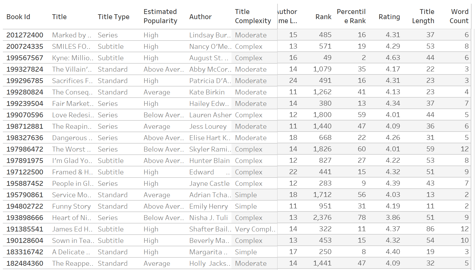
Essentially, in the dataset, we have information on the books, their authors, title and other metadata. In addition to that, we have key metrics including the rating of the book, length of title, percentile rank, and author name length. The prime metric in the data is of course, the book rating, but it would be interesting to see if there is a strong correlation between the outcome variable (rating) and some of the other metrics.
There are several key questions that popped up in my head. Against each key question, I plan to carve out a visualization that answers my question.
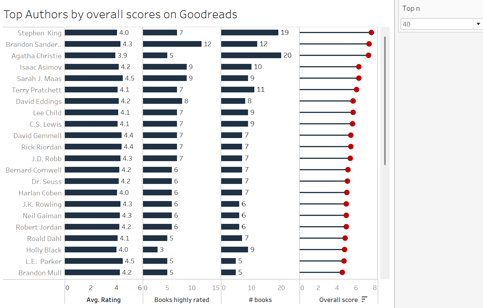
Question #1 - Which authors are most popular on Good Reads and how many books have they written?
Thought Process - I should be able to showcase an average rating of the books of the author, and also look at the distribution of the rank to see if there is a skewed distribution (one book is significantly more popular than the other).
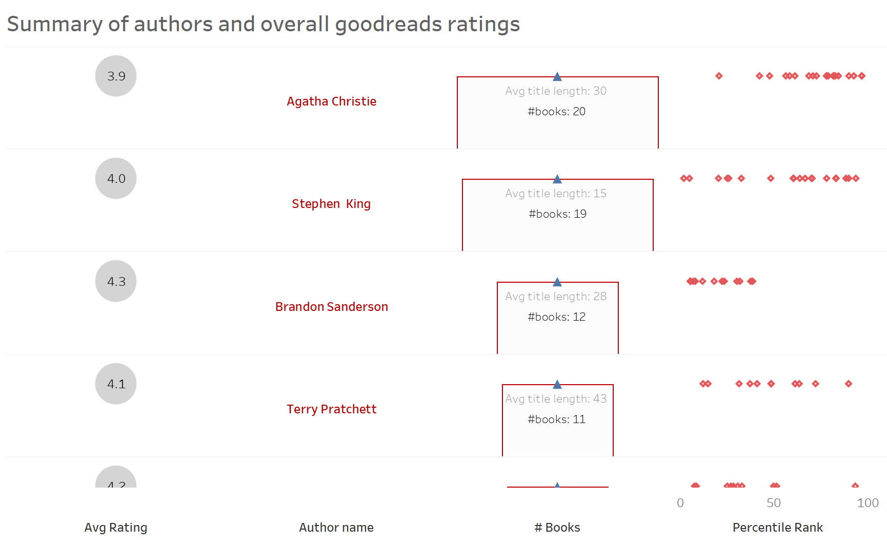
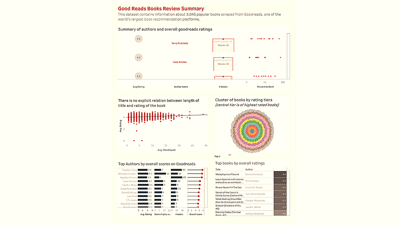
The above visual answers several questions in one view pertinent to the author - the average rating, the number of books, average title length, and most importantly the distribution of percentile rank. I used advanced tables in Tableau to quickly draw out this view (sorry for the bad formatting for now).
Question #2 - How can the books be clustered together amongst the rating tiers? Also, I should be able to select top books amongst tier 8-10 (highly rated).
Thought Process - I can obviously analyse the top books simply by ratings, but I want to analyse the clusters of the books, to conceptualize similar books in terms of ratings.
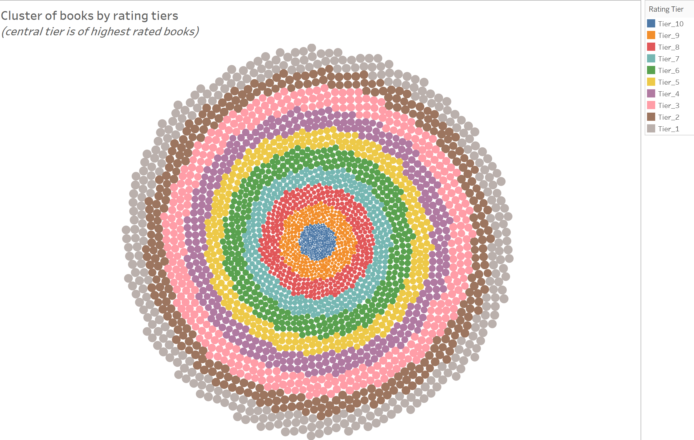
In this case, a radial chart works well for me because there are 3000+ books in the dataset and I could just hover over the dots in the radial to analyze highly rated vs lowly rated books.
Question #3 - This is more of a confirmation analysis. Is there a relationship between the length of the title and rating of the book? Of course, there does not seem to be but when we analyse large datasets, sometimes, certain patterns surprise us.
Thought Process - Plot of the scatter plot along with a regression line between the two metrics. See if a pattern emerges.
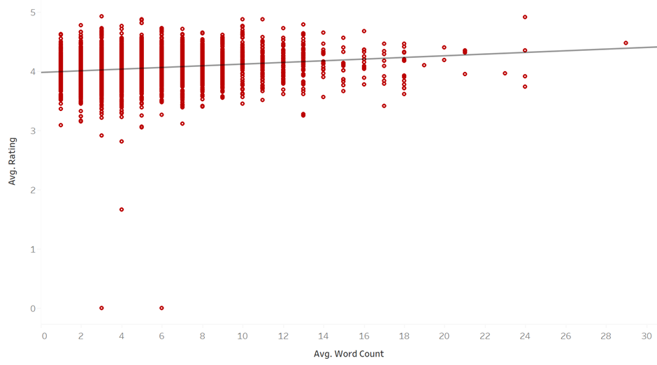
As our null hypothesis (assumed hypothesis) suggest, there does not seem to be a significant relationship between rating and word count.
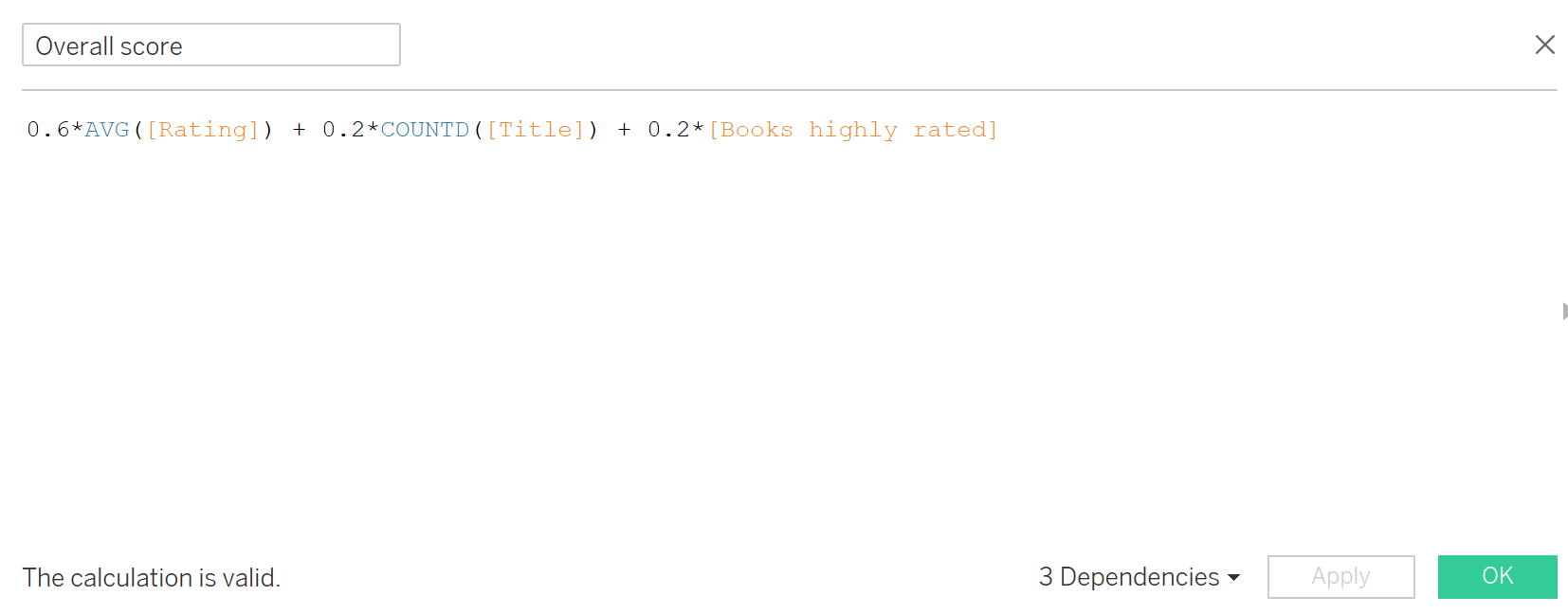
Question #3 - In our first analysis, we uncovered average rating of the author just by taking the average of ratings across all books. But what if there is just one book and has been rated by 10 people. Can we quantify an author's popularity differently?
Thought Process - In this particular dataset, we don't have the sample size (N count of the reviews). We just have the average rating. We also have information on number of highly rated books of the author. Lets go ahead and create a blended score per author.
I decided to created a calculated field signifying the blended score of the author using all these metrics. I apportioned 60% weightage to the overall average rating, 20% to the number of books, and 20% to highly rated books. Note that this is not a perfect methodology, and if we had more information, we could enhance this score further.
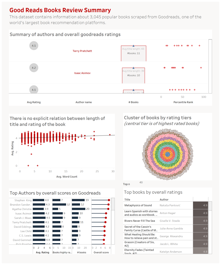
Consolidating everything together
Consolidation of visualizations and bringing a story together is known as the process of dashboarding. Lately there have been a lot of discussions on the styles of dashboarding, how relevant or irrelevant the skill will be across the organizations in future. One thing that I often see people ignoring or unintentionally missing out is the intent - which is storytelling through data. Storytelling through data is not going anywhere irrespective of the methodology to generate that story. Storytelling leads to decision making, opinion formation, and that leads to a stronger data-driven culture in the organizations. We should therefore, not stop embracing this process irrespective of how AI is making it simpler.
As to design:
- I always focus on key analysis questions first. Then I play around with data to answer those questions.
- It is important to carve out simplest of the visualizations which would answer the key business questions for the stakeholders.
- Placement of visualizations across the dashboard in the right order of importance is also important. For example: the order of visuals should be as per the importance - most important visualizations at the top.
- Drilling down the information (from top to bottom or from one screen to another) is also an art as to how we connect the dots for the stakeholders. We should follow the pyramid framework.
All in all - it is important to answer 80% of the questions of the stakeholders in the best way possible, instead of intending to answer 100%, and then leading to low adoption scales because of the complexity and nuances. I have personally experienced this happening a lot!!
I quickly put together a dashboard from the visualizations described above (I know the formatting can be improved significantly 😃)
Improvements
No analysis is perfect. The goal should be to reflect the right information that reflects the real picture to max extent possible in a given frame of time and space.
With each analysis, there are certain assumptions and caveats we need to be aware of, and those caveats should be called out upfront to set the right expectations. For example:
- The N size (number of reviews) would add a high degree of confidence in the analysis. For ex: a book with 4.9 rating with 20 reviews is probably not as good as a book with 4.5 rating and 2K+ reviews. Adding that lens in future would improve this analysis significantly.
- Extracting this information and performing this analysis in real-time would be much better. Ratings of the books keeps on constantly changing with more readers being added in the mix continuously
- 3K books is probably not a large enough sample. Performing this analysis on all the books would increase the confidence level of the analysis (by law of large numbers).
If you like my blogs, please subscribe :) I would really appreciate it!